June 2026

Designing for Summer Buyers

Finish Selections Making an Impact

Downing Duraform Harbor Bedroom

Every season brings a shift in what homebuyers are drawn to, and summer is no exception.

As model traffic increases and buyers spend more time exploring communities, cabinet finishes often become one of the most talked-about design features in the home.

Maddox 5-PC Maple Cider & Painted Oat

Longer daylight hours, brighter natural light, and more frequent model home tours all influence how finishes look and feel in real time. For builders, this season is an opportunity to lean into selections that photograph well, feel welcoming during walkthroughs, and support confident buyer decisions in the design center.

Let's dive into our summer favorites and how they’re performing in today’s homes.


Warm Neutrals That Feel Light, Not Stark

Painted Oat

Painted Vanilla

Painted Harbor

Summer model homes are often experienced at their brightest point of the day. Natural light pours into kitchens, highlighting every surface, edge, and material choice. In that environment, overly stark whites can feel harsh or unfinished.

Warm neutrals like Painted Oat, Vanilla, and Harbor create a softer visual foundation. They keep spaces feeling open and airy while introducing just enough warmth to make a home feel inviting from the moment buyers step inside.

Maddox 5-PC Painted Oat

Windsor 5-PC Painted Vanilla

From a builder standpoint, these finishes also reduce friction in the selection process. Their versatility allows them to coordinate easily with a wide range of countertops, flooring, and hardware packages. That flexibility helps buyers make decisions faster and with more confidence, which is especially valuable during peak summer selling season.

Where they work best: Full kitchens, perimeter cabinetry, and cohesive spec packages where flexibility and broad appeal are key priorities.


Maddox 5-PC Painted Harbor


Organic Color That Connects Indoors and Out

Summer design is strongly influenced by connection to the outdoors. Buyers are spending more time in patios, outdoor kitchens, and open living spaces that blur the line between inside and outside living.

Painted Sage supports that mindset with a grounded, nature-inspired tone that feels calm without being muted or forgettable.

It introduces color in a way that still feels approachable for a wide range of buyers.

In two-tone applications, Sage becomes even more impactful. Pairing it with Painted Linen or Painted Vanilla allows builders to introduce contrast while keeping the overall palette balanced and market friendly.

This combination works especially well in model homes where visual interest needs to be strong without increasing design complexity.

Where it works best: Kitchen perimeters, vanities, and two-tone layouts paired with warm neutrals or natural wood islands.

Painted Sage

Corban 5-PC Painted Sage & Painted Vanilla


Confident Contrast for Model Home Impact

Not every summer space needs to feel light and minimal. Some of the most memorable model homes use contrast strategically to create focal points that buyers remember long after they leave.

Painted Navy

Painted Linen

Painted Navy and Linen bring depth and structure into a kitchen without overwhelming the space. When used on islands or lower cabinetry, these finishes anchor the design and naturally draw the eye.

From a merchandising perspective, this kind of contrast is especially effective. A well-designed island in a deeper tone often becomes the emotional centerpiece of the kitchen, which can influence upgrade conversations and increase perceived value during tours. Builders can maintain neutral perimeter selections while still delivering a strong visual moment that elevates the overall home.

Where they work best: Kitchen islands, built-in features, or accent cabinetry in otherwise neutral layouts.

Beckley Painted Navy & Painted Linen


Natural Wood That Feels Intentional, Not Heavy

Maple Cider

Maple Latte

Maple Rye

Stained wood cabinetry continues to gain traction as buyers look for homes that feel warmer and more layered. In summer light, wood finishes become even more dynamic, with grain and tone becoming more visible and expressive throughout the day.

Unlike full wood-dominant kitchens of the past, today’s approach is more intentional. Builders are incorporating stained elements in ways that add depth without overwhelming the space. Islands, range hoods, floating shelves, and bathroom vanities are all common applications that introduce warmth while maintaining a balanced overall design.

Barnett Maple Cider

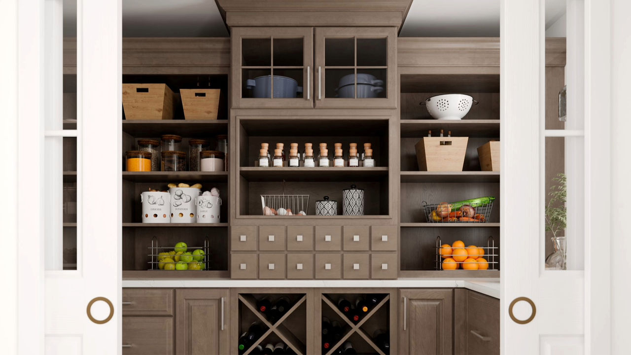
Maple Cider in particular stands out for its ability to feel both modern and grounded, making it a strong option for builders looking to add character without limiting buyer appeal.

Where they work best: Islands, accent cabinetry, hood surrounds, shelving, and bathroom focal points


Sierra Vista Maple Latte & Painted Vanilla

Fairfield Rye


Still Relevant in Summer: Soft Grays and Transitional Neutrals

Painted Stone

Painted Mist

While design direction continues to move toward warmth, soft grays remain a reliable part of many builder programs. The key difference today is in how they’re used.

Modern grays lean warmer and more natural than in years past, avoiding the cooler tones that once defined “builder-grade” design. These updated neutrals work particularly well in communities where consistency and long-term appeal are priorities.

When paired with the right countertops and hardware selections, these finishes still feel current while offering the predictability many builders value in spec and production environments.

Where they work best: High-volume communities, spec homes, and projects requiring broad buyer acceptance.

New Haven Painted Mist

Sonoma 5-PC Painted Stone


What We’re Seeing This Summer

Across communities, there is a clear shift toward finishes that balance warmth, flexibility, and personality. Buyers are responding to homes that feel bright and open during tours but also layered enough to feel lived in and intentional.

Rather than expanding finish catalogs, many builders are finding success by refining their core selection sets. A focused mix of warm neutrals, soft color, natural wood, and strategic contrast is proving to be more effective than offering an overly broad range of options.

This approach not only simplifies the design center experience but also strengthens marketing consistency across model homes and spec inventory.

New Haven Painted Linen


Building a Finish Strategy for Summer and Beyond

Summer is one of the most active seasons in homebuilding, making it an ideal time to evaluate how finishes are performing across your communities. The most successful programs are not built on volume, but on intention.

A curated selection of finishes that work together across cabinet lines, coordinate with countertop and flooring packages, and photograph well in natural light can make a measurable difference in buyer experience.

Whether you are refreshing a model home, planning upcoming specs, or refining your design center offerings, the right finish strategy helps create homes that feel cohesive, confident, and ready for today’s buyers.

Explore & Fine Tune

See more of Timberlake.

K_TL_58GGS_58FDS_C_24_16x9.jpg

Define Your Style

Compare door styles or explore colors and finishes.

Explore Resources

Explore support and resources or reach out to us.